pk.is
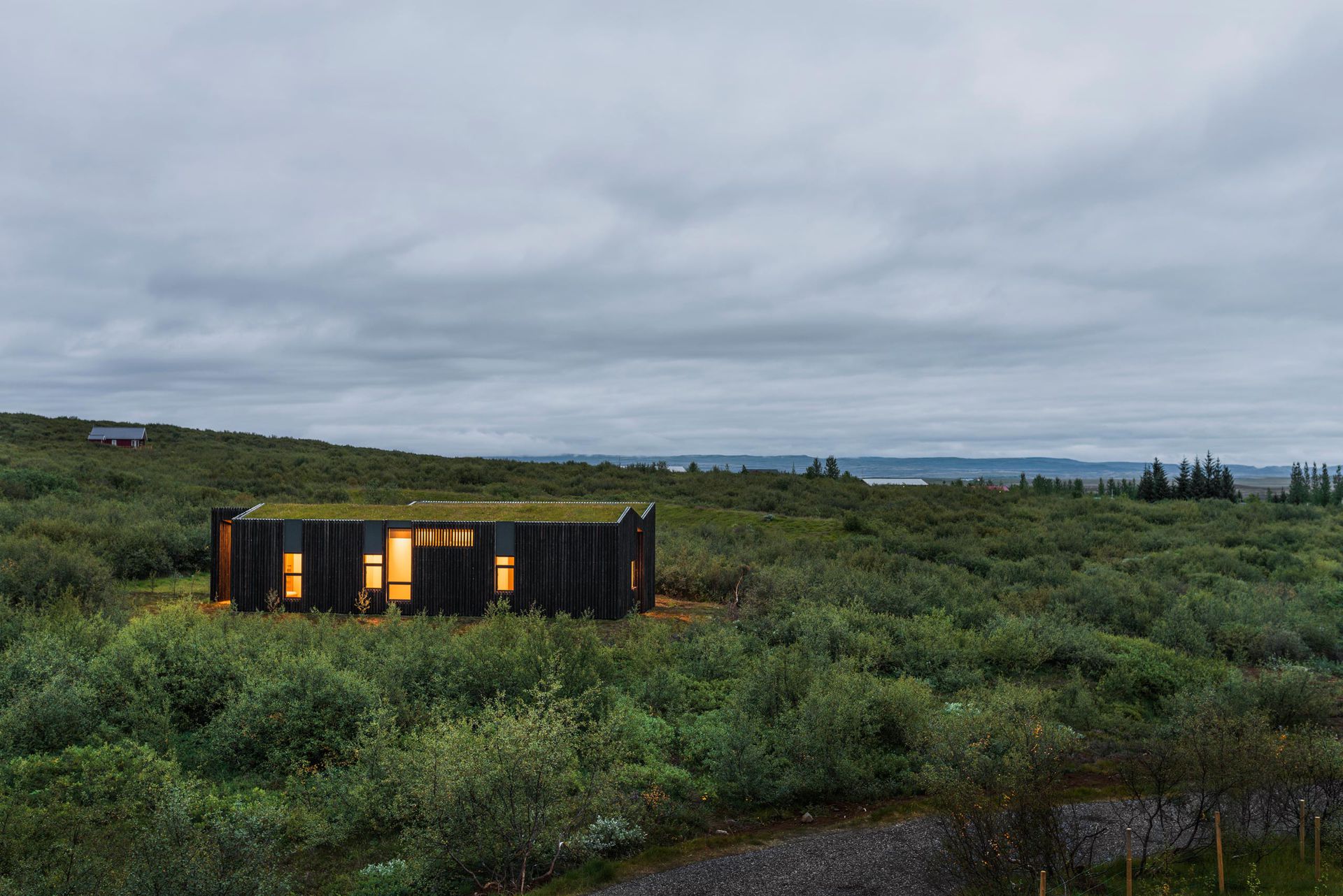
A portfolio website for an award-winning Icelandic architecture studio. The brief was one word: weird. The result is an image-first frontend where photography does the talking.
Let the photography speak. Navigation, layout, transitions and everything else is invisible until you need it.
the brief
PK Arkitektar is one of Iceland's respected architecture studios. Their work has won international awards and been published widely. They came to us with the result of a huge photoshoot, and a single creative direction: make it weird.
Images first
The photography is extraordinary. The site must be built around it — not the other way around.
No templates
They didn't want a standard architecture portfolio. The interaction should feel unfamiliar but intuitive.
Easy upload
The team uploads all images at once per project. No manual cropping, ordering, or metadata entry.
Fast & light
Image-heavy but performance-conscious. No framework bloat. Load fast, scroll smooth.
what "weird" means
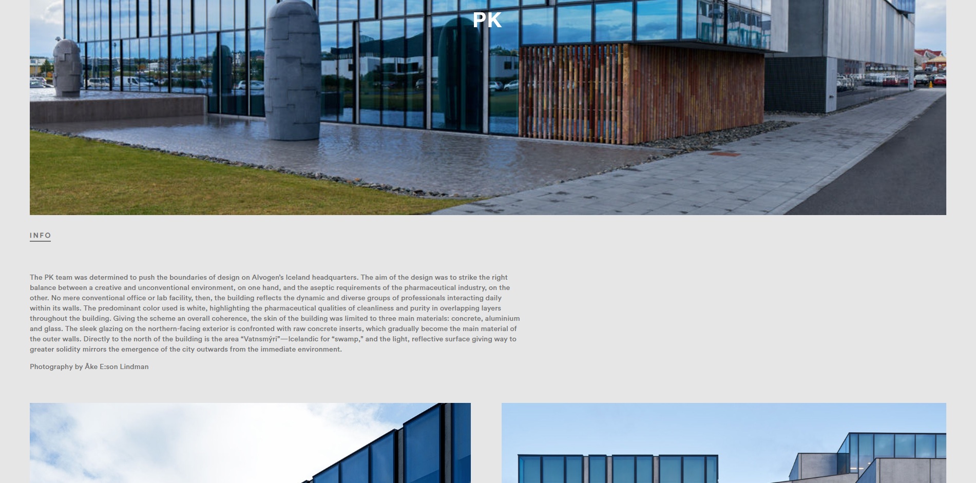
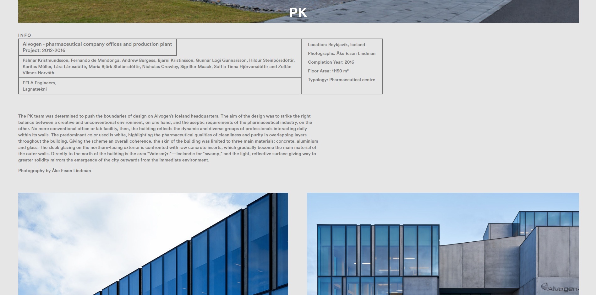
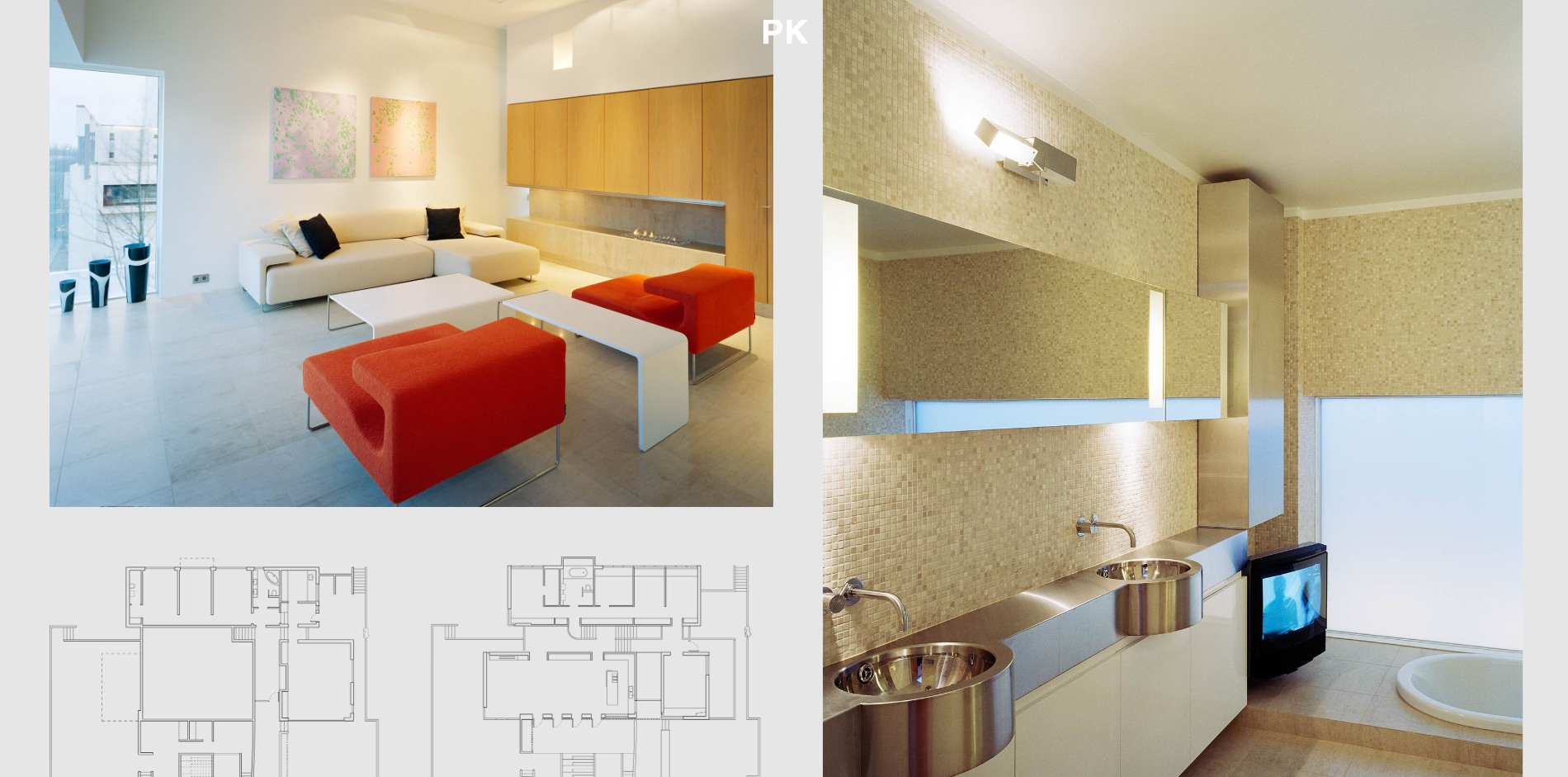
The word weird doesn't mean random. It means unexpected. The layout feels alive — images shift, scale, and reposition based on their own proportions. No two project pages look the same, but every page feels like the same site.
Unconventional grid
Instead of a fixed masonry or uniform grid, the layout engine reads image dimensions and arranges them into compositions that feel curated — but are entirely generated. Wide panoramas stretch. Tall interiors stack. Square details cluster.
Minimal chrome
No visible navigation bar. No sidebar. No footer until you reach it. The interface appears when you interact — hover, scroll, click — and disappears when you stop. The architecture is the content and the decoration.
Over a 10-year collaboration, the website has remained stable and purpose-driven, without the need for constant updates or feature expansion. Built on a reliable, long-term CMS, the system continues to support the company's needs with minimal intervention. During this period, only one major update and a single server migration were required — reflecting a high level of technical stability. Aside from a few targeted improvements, the original structure and simplicity have proven effective over time, demonstrating that a well-defined system can remain relevant and functional without continuous change.
the image system
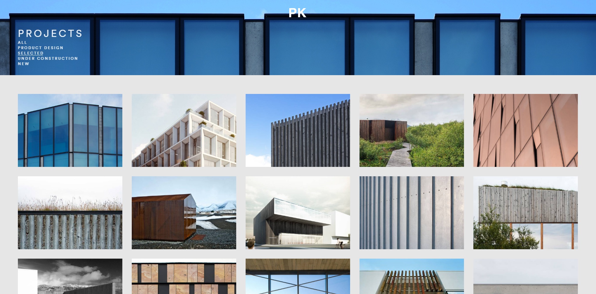
All images for a project are uploaded in a single batch. No manual sorting, no drag-and-drop ordering, no caption fields. The JavaScript engine reads embedded image data — dimensions, aspect ratio, orientation — and decides how to arrange them.
The layout is deterministic: same images, same result. But add or remove a photo and the entire composition recalculates. The system treats each project as a unique set and generates a layout that emphasizes the best shots.
motion everywhere
Each interaction triggers smooth, purposeful transitions, subtle fades and motion that guide navigation. Background visuals shift with the site’s structure, reinforcing orientation and flow without distraction, creating a cohesive and fluid browsing experience.
A Drupal-based PHP CMS operates in the background, ensuring efficient content management and controlled development costs. Despite full page reloads on interaction, transitions remain consistent and visually seamless.
site pages
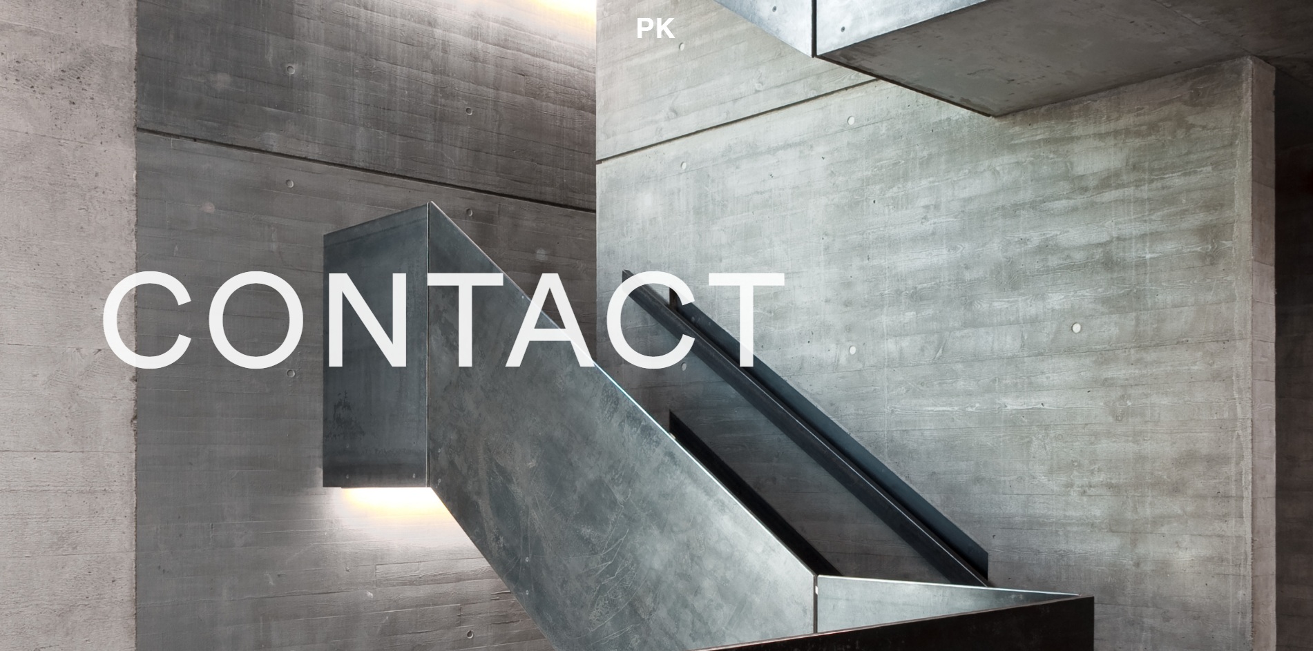
Beyond the project portfolio, the site includes studio information, news, and contact — all following the same minimal, image-forward design language.
Projects
Grid of all projects. Each card is a single hero image — no titles until hover. Click opens the full image-driven project view.
Office
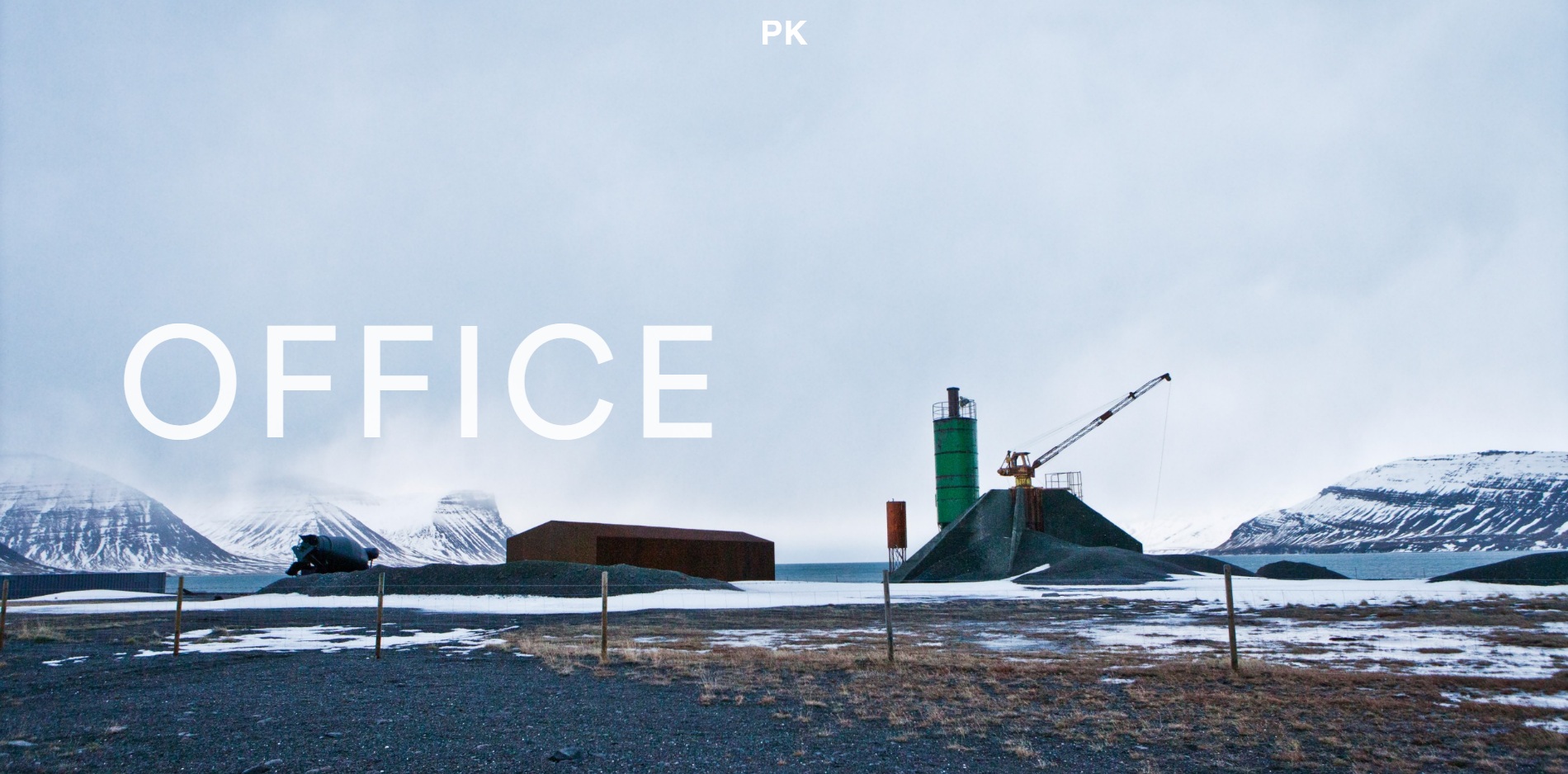
Studio info, team, and philosophy. Same clean layout as project pages — photography of the workspace and the people.
News
Awards, publications, and featured projects. Minimal text cards with dates. Links to external press coverage.
No grid system
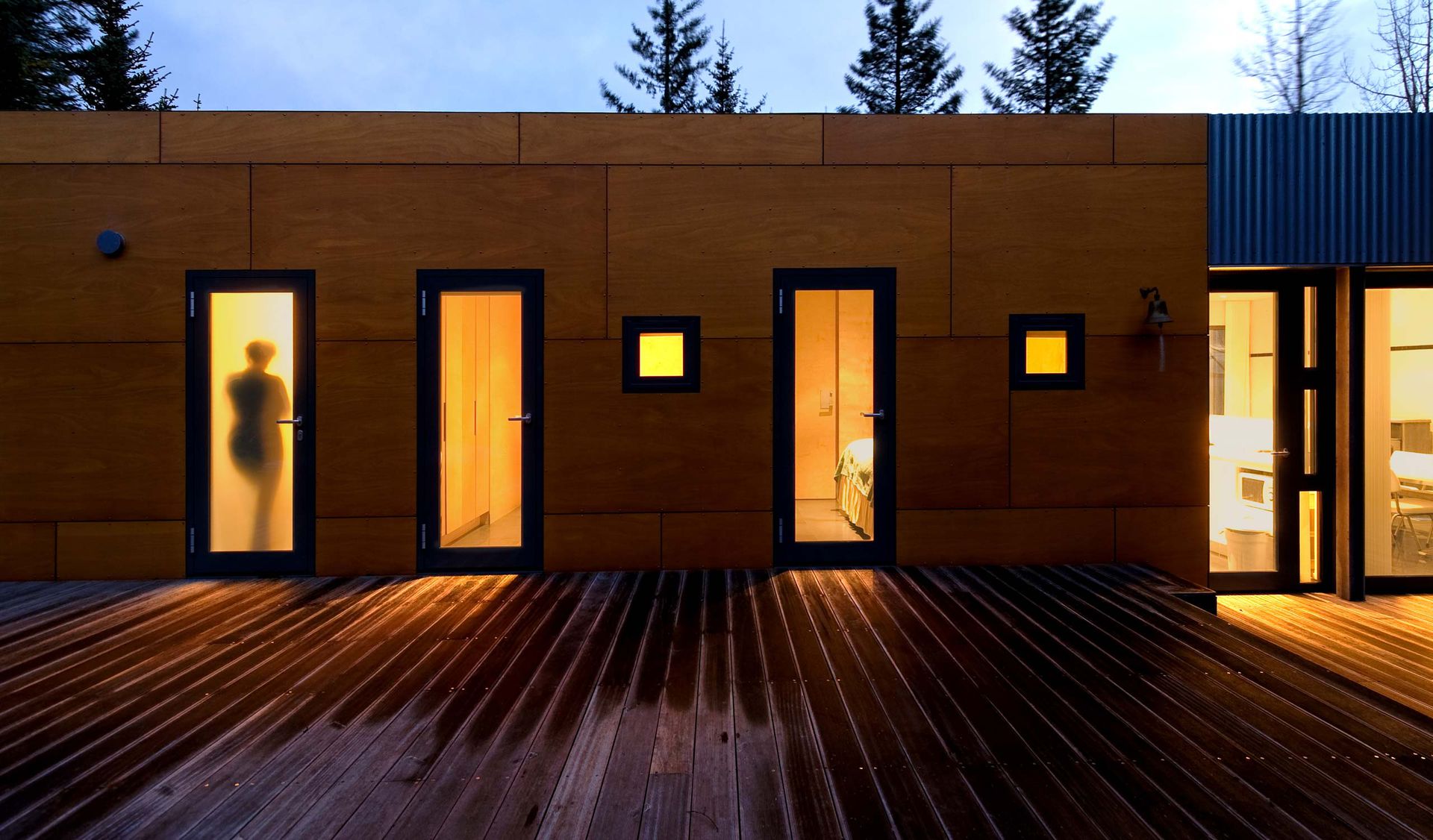
The layout is computed from real image data, not predefined columns. Every project generates its own visual rhythm.
Zero admin friction
Upload a folder of photos. Quick info addition, everything is optional, no unnecessary CMS fields to fill, no image slots to manage.
Weird on purpose
The client didn't want conventional. The interaction model breaks expectations — and that's the point for a creative studio.
Images do the work
Architecture photography is the entire interface. Text is secondary. The buildings tell the story.
have an idea?
let's make it work.
Send us a message and we'll get back to you quickly.